Residential
Call for price
Description
Genesis of Noble
The concept of the logo is developed around neutral and linear art, forming an up-rise structure that represents steady growth. The design further grows and eventually forms the alphabet “N”, symbolizing the project name “NOBLE”.
The designed logo promotes the true meaning of the word “NOBLE” which is belonging to the class of higher virtues and moral principles. The graphics are structured in a simple and modern contemporary way, using medium-bold typeface and charcoal grey & deep yellow color palette.
Besides representing the construction industry, the chosen color scheme represents high values as well. The charcoal grey is the symbol of strength and depth while deep yellow gives away the feeling of optimism prosperity.
A Commitment to Surpass the Ordinary
Strong foundation, strong thinking, strong determination when combined make Noble Ventures. A symbol that is at the epitome of strength and valor that co-relates with the company’s vision and philosophy. It is not just an inspiration but the base of our commitment, to surpass the ordinary.
Noble Ventures has been primarily in the business of execution of projects in India compromising of Industrial Civil & Structural, Multidiscipline Infrastructural Development, and Residential cum Commercial Projects over two decades. We have been consistently credited for the timely implementation of projects across the country.
The dynamic and experienced Directors are the ones who lead various projects like HPCL – Mittal Energy Limited, INOX, M/s Rajiv Gandhi Cancer Institute & Research Centre, M/s Bharti heavy electrical limited, Naphtha Cracker Project for IOCL Panipat, ONGC Petro additions project at Dahej Gujarat, Staff Houses at HMEL Refinery Bathinda, Shopping arcade in Bathinda, a Shopping mall with 650 showrooms & shops at Patiala and Barnala, Residential projects in Mohali, Dabwali & Bathinda and more to successful and timely completion. Families are already residing in our two group housing project – White Lilly with 550 flats and 650 flats.
The Story of Callista
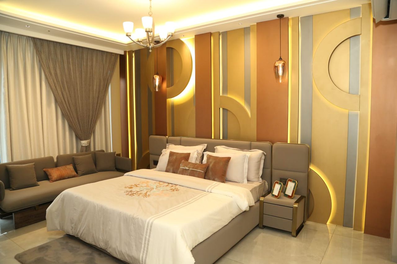
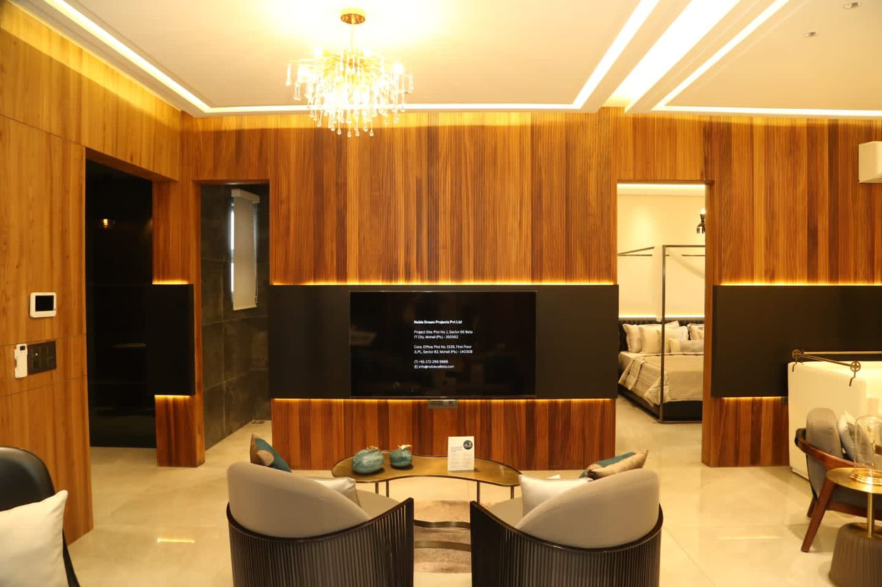
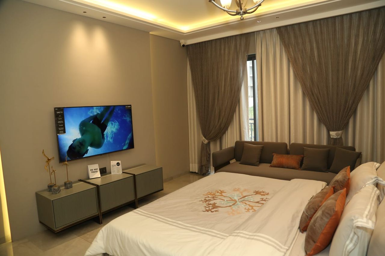
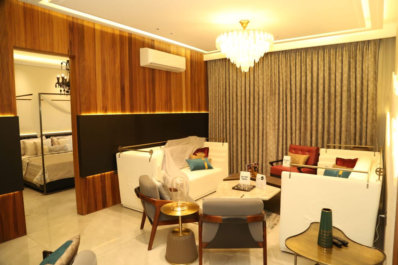
The logo was initially pictured as something which could do justice with the name and the essence of this project. The project’s world-class architecture & Noble’s belief to serve comfort with luxury is perfectly replicated by the logo.
The Golden leaf is all about luxury, calmness, nature, and flexibility. The logo rules the realm of opulence. It is designed with a modern typeface- “San serif” font which defines a distinguished class. The standing golden leaf, very conveniently, demonstrates the idea and vision behind the project. Golden synonymies the rich class, upmarket living, high standards, and out-of-ordinary life choices.

